Mon 21 Aug 2006
For this week’s discussion, I bring you two long term charts…
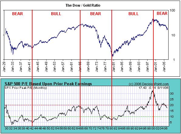
The first is a chart of the Dow/Gold since 1929, positioned above the S&P 500’s running P/E ratio over the same time period.
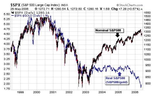
The second chart is basically zooming in on the last 5 years on the chart to look at the S&P 500 in both nominal terms and relative to the price of gold.
Ignoring the fact that these charts freely mix both Dow and S&P 500 data, these are the long-term trends that are the basis for my current beleifs about the markets. The terms secular bear market, P/E compression, and inflation or stagflation would apply.