Sun 12 Nov 2006
I saw an ad for the newly redesigned quote.com website, and went to take a look… the website is nice, but I found a rather dubious headline chart:
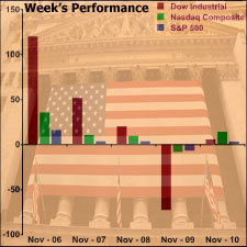
Now it’s nice to see the relative performance of the major indexes, but why would you compare them like this? The Dow was up over 100 points on Monday, while the Nasdaq Composite was up less than 50 points. Does that contain any relevant information?
If they were trying to show anything accurately, they would show that the Nasdaq was up 1.5% and the Dow was up 1.2% on Monday. In fact, the Nasdaq Composite has outperformed the Dow since August.