Sat 5 Jan 2008
I ran into this interesting post over at the Bespoke website…
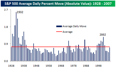
While most would agree that the stock market has certainly been more volatile this year, putting it in perspective with the long term trend shows that by at least one measure, the S&P 500 was less volatile this year than its long term average.
The chart below summarizes the average absolute daily price change in the S&P 500 by year. In 2007, the average worked out to 72 basis points, which means that, on average, the S&P 500 had a daily move (up or down) of 0.72% versus an average of 0.75% since 1928. While this year was more volatile than the last three years, prior to those years, the last time the market was this ‘placid’ was in 1996.
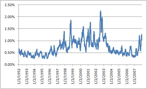
While this is a very good point and good analysis, I decided to do a little of my own analysis and found… I don’t have as much data as Bespoke does. Going back to 1950 (the furthest back I can go with free and easily available data from Yahoo Finance), the average daily change is 0.62%. That makes sense, considering that I couldn’t include the 1930s when volatility was so high.
Despite that, I forged on to find a few interesting things… if I look at the 30 day moving average of daily price change, we get a slightly different picture. The average volatility for 2007 has been skewed lower from the low-volatility of the first 6 months of the year. Outside of the last three years, the last time volatility was this high/low was early 2002 when the markets were mid-patriot rally.
Similarly, it is worth looking at volatility on multi-day time frames, such as weekly price change or monthly price change. As we go to longer time frames, the changes look more similar to the first chart that Bespoke published.