March 2009
Monthly Archive
Wed 11 Mar 2009
Posted by Jason G. under
MacroNo Comments
If you’re not familiar with the phrase “this time it’s different”, …
The thing worth noting is that everyone who might say “this time it’s different” in bullish times is lambasted. But in bearish times, everyone is basically saying this… to pick on one person, John Mauldin recently wrote “We are in an economic period unlike any other we have faced.” I don’t want to make light of the difficulties we face in the economy right now, but isn’t this a couched way of saying this time it’s different?
It reminds me of an old saying in sociology/psychology… Functional families are all the same, but dysfunctional families are all messed up in their own unique ways.
Can we say the same for the markets? Bull markets are all the same, but bear markets are all messed up in their own unique ways?
Wed 11 Mar 2009
Posted by Jason G. under
CommentaryNo Comments
Short answer: no. At least not from where I’m sitting.
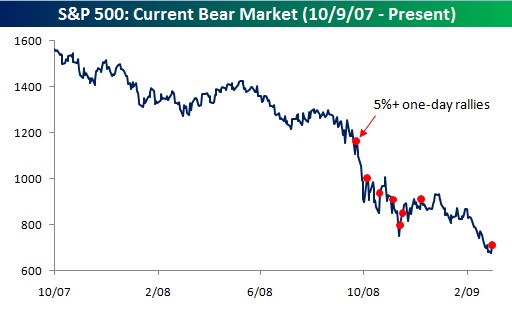
Bear markets don’t typically end with a bang like that, and the large single day move is more typical of bear market rallies than of a new bull market. Oh, and maybe we could string together more than a single up-day in a row before getting too excited.
Bespoke points out, “we would note that today’s gain is the eighth one-day rally of 5% or more since the S&P 500 peaked in October 2007, and we’re lower now than we were at the close of any of those seven other days.”
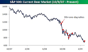
The caveat is that we’re long overdue for a rally, any rally, and we could see a reasonable run for a while (translation – 3 to 6 months). The most bearish scenario (from a technical analysis perspective) would be for the S&P to rally to ~740 to test the recent breakout, before turning down again. Also, I’ve noticed the speed at which markets approach resistance influences whether they will bounce back from those levels — the faster the approach, the more likely resistance will hold.
Tue 10 Mar 2009
Posted by Jason G. under
Commentary1 Comment
Over the weekend I was reading John Mauldin’s weekly email, and I had a thought that sums up the situation with the banks.
They’re all idiots, though that wasn’t my thought. They ran their businesses in ways guaranteed to make them weak hands later in the business cycle, simply because the rules allowed them to do so.
Even if the rules allow me to put AAA rated MBS paper in my capital reserves, and I can use that capital reserves to loan more money, then it doesn’t mean that I should necessarily do that. A little bit of conservative accounting might be in order when we’re talking about new securities and rules that are not fully understood.
It’s as if I read about being able to run my truck on soybean oil, going out to buy a truckload of soybeans, and then entering shipping contracts to ship stuff all over the country with my truck — all before checking to see if the new fuel will even work!
Banks are in a special category… their retail inventory is money, which makes things a little more complicated. In theory, the money should be fungible and a dollar in capital reserves should be equivalent to a dollar in shareholder liabilities. But it isn’t, especially when financial innovation (and corrupt ratings agencies) allow illiquid securities to be counted as capital reserves.
Honestly, any banker that bought MBS and counted them as part of their capital reserves because a rule allowed them to is effectively a “weak hand” and should be put out of business. If you buy an asset without the ability to hold that asset to maturity, you’re basically playing russian roulette with your bank.
If you can’t or don’t want to mark something to market, you shouldn’t be using it as a capital reserve.
Mon 9 Mar 2009
Posted by Jason G. under
CommentaryNo Comments
Tech Ticker has a little video about the 5 stages of grief, investing edition. In case you’ve forgotten the 5 stages, here they are:
- Denial
- Anger
- Bargaining
- Depression
- Acceptance
Click through to tech ticker to get some examples of each.
Wikipedia cites that “Grief is a multi-faceted response to loss. Although conventionally focused on the emotional response to loss, it also has physical, cognitive, behavioral, social, and philosophical dimensions.”
While most people think that stock investors are grieving over monetary losses, it shouldn’t be ignored that they’re also grieving over the loss of a bull market, easy decisions, and the loss of certainty. When the market was going up slowly and steadily, it was easy to plan. When you don’t know how large your losses will be on a week-to-week basis, it puts a big crimp in planning for the future.
Thu 5 Mar 2009
Posted by Jason G. under
CommentaryNo Comments

Author G. Edward Griffin gets points in my book for his writing, and not just for the awesome title to his book The Creature from Jekyll Island. The book is actually about the creation of the Federal Reserve, and his book is apparently all the rage these days — it is sold out on Amazon.
More interesting, and more accessible (while Amazon is out of stock) is an interview he did with Financial Sense on February 28, 2009. You can stream it from their website or download it in mp3 format.
We all like to lambast the Fed and Treasury politicians officials for bumbling things so badly, but what if we consider the alternative? That things are going according to plan, and the plan is to create a totalitarian state?
From Chapter Two: The Name of the Game is Bailout:
The final solution on behalf of the banking cartel is to have the federal government guarantee payment of the loan should the borrower default in the future. This is accomplished by convincing Congress that not to do so would result in great damage to the economy and hardship for the people. From that point forward, the burden of the loan is removed from the bank’s ledger and transferred to the taxpayer.
Note that I don’t have the book, and am relying on this page for the text above.
A lot of people think Griffin is a kook, but I’ll leave that up to you… Also bear in mind, he wrote the book in 2002.
Originally found via ZenTrader.
Wed 4 Mar 2009
Posted by Jason G. under
Commentary1 Comment
A neat little feature at StockCharts is the Vol By Price annotation on the charts. Here are the charts from yesterday with this feature turned on.
Note, I used the Dow index instead of the SPX due to a lack of volume data for SPX in the 90s on their website.
link
I’m not quite sure how they calculate the bars on the chart, but you can at least see the relative volume traded within different price ranges. I also assume the black and red division is how the up/down volume is divided in that price range (black = volume from up days).
link
You’ll notice the rather large volume in the 95-98 range in both the 5500 and 7800 ranges. Does this mean those are stronger areas of support? You tell me.
link
I’ve included the links to the StockCharts pages so you can go play around with timeframes and the other indicators, if you’re interested in that sort of thing.
Wed 4 Mar 2009
Posted by Jason G. under
CommentaryNo Comments
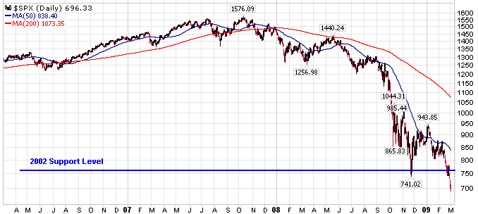
I was just looking over some charts, and figured I would upload a few here to share my thoughts.
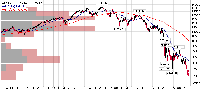
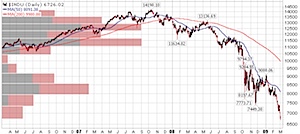
As far as the SPX is concerned, I think it has decisively breached support. Whether it turns out to be a false breakout or not depends more on time than on distance (in my opinion). With the time frames being so long (97 to 02 to 09), I wouldn’t call it one way or the other for another 6 months or so…
Here is the most recent 3 years of the S&P 500 (SPX) Index:
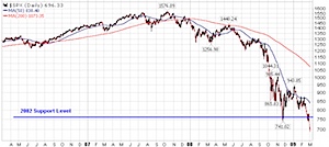
link
That line on the chart marked 2002 support level is approximately the lows back in 2002. Many would argue (and justifiably so)that support lines are a range of support, so take the hard, thin line with a grain of salt.
link
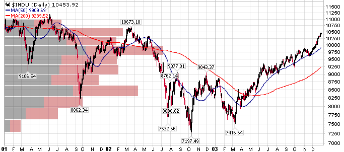
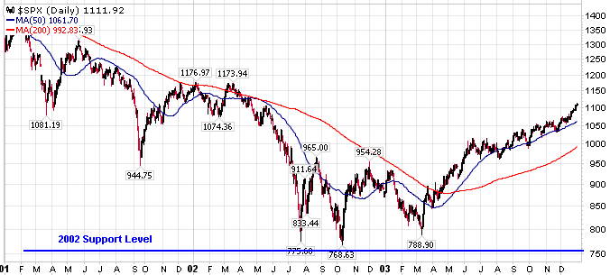
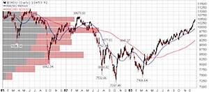
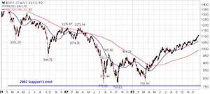
And here is the same line going back to 1997 timeframe…
link
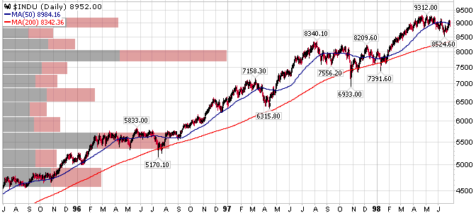
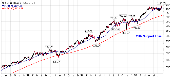
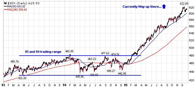
If the current breakdown isn’t a false breakout, then the 1996 trading range would come into play as the next support zone.
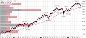
link
I’m not basing any of my trading off of these support zones, though many other people do, thus creating a self-fulfilling prophecy. To me, the real value is knowing where other people are focusing, and adapting to the situation as it unfolds.
As they say, technical analysis is in the eye of the beholder.
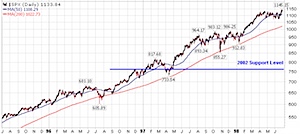
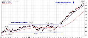
Coincidentally, you can see the same relative approximate support zones in the Dow (current, 2002, 1996, 1996 closeup).
Amazingly enough, the Nasdaq (NDX or COMPQ) hasn’t broken below the November 2008 lows yet. One potential cause for this — it had already fallen 54% from its 2007 peak (NDX specifically), while the SPX is now at the same 55% decline. Basically both the NDX and SPX are at the same position relative to their highs, the NDX just dropped further (was an outperformer to the downside) during last year’s market lows.
Another cause is the fact that the NDX specifically excludes financial companies, and this sector is obviously not contributing well to overall market strength.
« Previous Page