Tue 23 Feb 2010
More great stuff from Hussman’s weekly commentary on Monday:
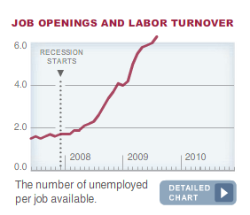
Aside from the shorter-term suspicion that unemployment has not peaked, I want to be clear that my main concern about the employment situation is with servicing debt, not providing for the basic needs of the population. I’m certainly not talking about Malthusian macroeconomic shortages or an inability for our nation to support itself. It is the gap between cash flows and household debt service that strikes me as problematic.
Hussman agrees with something I stated a while back… this is not your grandfather’s depression. While people starved to death in the dust bowl of the 30s, our struggle is less about survival and more about quality of life.
He then goes on with this comment:
Over the past decade we have greatly threatened that that stability through the ridiculous misallocation of resources in speculative bubbles and unproductive “investments,” but I am convinced that we will re-learn, painfully or otherwise, to better allocate our resources. My impression continues to be that the current deleveraging cycle will likely be a multi-year process that is presently far from complete.
Foreign trade can also be the source of mutual economic benefit, but only if it ultimately improves the allocation of resources. On our current path, we have instead relied on cheap imports from China and other countries while at the same time destroying our own capital through poorly allocated speculative investments, followed by bailouts to the lenders who provided that capital. The only plausible outcome of that dynamic is that foreigners will gradually acquire claims on our nation (Treasury debt or private securities), and with them, the ability to acquire our productive assets. No doubt many analysts on the financial channels will gurgle with excitement every time a foreign acquirer bids for ownership of a U.S. company, but this is how we will pay for our the difference between our consumption and our income. Again though, I am convinced that we will ultimately re-learn to better allocate our resources.
Good stuff.