Tue 18 Jul 2006
So, I’ve used BigCharts for over 9 years now, but I recently noticed a new feature. You can chart the P/E Ratio, Yield, Rolling EPS, and a few other fields below a price chart. (I’ve known since the beginning about the more traditional technical indicators that can be shown there.)
The data is a bit off in a few cases, but you can get some interesting little charts.
For example, check out this chart of the SPX (S&P 500) index for the last 10 years.
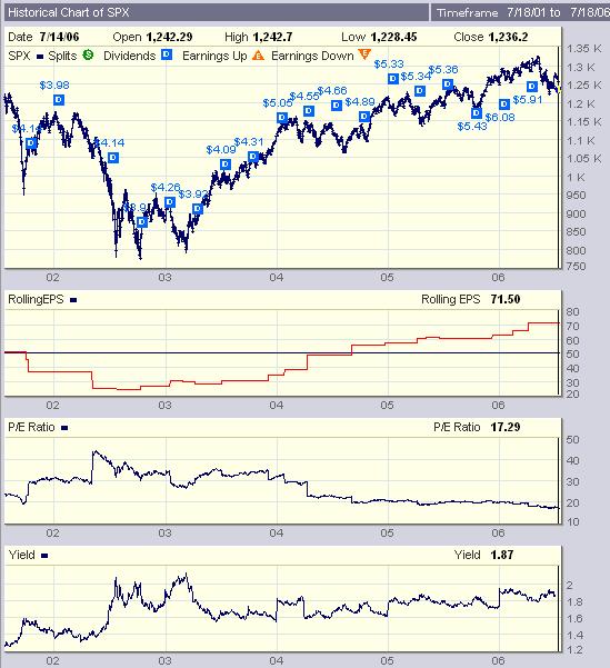
You might notice the downward slope of the P/E ratio (since mid-year 2002) over such a long time frame. That’s the P/E compression that tends to be a dominant part of the secular bear argument.
Despite the very impressive rise in the earnings per share, prices have not kept up, hence the declining P/E ratio.
Unfortunately BigCharts doesn’t have the data going back far enough to really look at the EPS, P/E and Yield over a longer time frame. For that, you’ll have to go to another source.
This charting is also quite helpful in looking at the trends in earnings and multilpes for individual companies.