Thu 20 Jul 2006
We’ve spent some time in person discussing “magnet” or “density” points but there hasn’t been any data thrown up on the blog. Given the hooplah over yesterday’s bounce (anybody smell a dead cat?), I thought I’d use it to take a closer look at these little buggers. For example, why did the market, obviously trending up all day, stop where it did? Could a trader have gone into the day with any information that could have helped in making decisions? Let’s see.
Here is a chart showing the profile of the September Mini Dow Futures contract (because I have easy access to futures data at the intraday level needed to do this) as of the close on 7/18, before the big rise. Let me emphasize that last point: BEFORE the big rise. In other words this was information available to a would-be trader going into Wednesday morning. Normally, I build these with 30-min. data because it seems to provide the best resolution but I couldn’t get it going back far enough to be useful. So I went with 90 min. data. In the big picture, it doesn’t make a difference. Now go ahead and look at the chart. Go on. Don’t be scared. I’ll be right here when you finish.
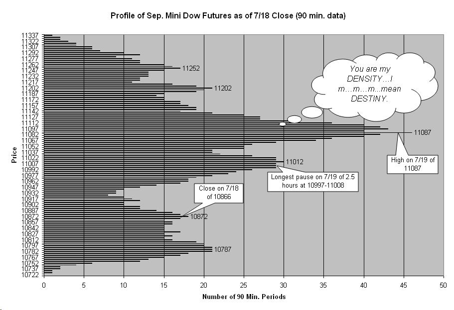
Update: I rotated the axis of the image to match the normal way of thinking about price as “up” or “down”. I also removed after-hours trading which, because price tends to just sit in one place for a long time, distorts the picture a little.
Back? Didn’t know charts could talk, did ya? Anyway, has it hit you yet how FREAKIN’ AWESOME this chart is? Do I need to remind you that this chart was not made after the fact and those 2 huge humps where price reacted on 7/19 were in already in place days before? Now admittedly, there isn’t anything (yet discovered) about this chart that would have foretold that the market was going to go up like it did but it sure as hell knew where it was likely to stop if it did. This has potentially huge implications for profit taking for longs. Or, perhaps, once the momentum was recognized, you could have more easily measured the potential remaining in the move. I mean, haven’t you ever second-guessed a momentum move, wondering if it might be too late to enter and grab a piece? While it’s certainly worth the effort to search for predictive possibilities to this type of analysis, it’s already pretty fascinating to see the more reactionary support and resistance at work. This isn’t your pappa’s tired, old support and resistance. It’s entirely possible that the markets future is, to some degree, mapped out ahead of time. Now, surely, some input from the news and uncertainty goes into the mix also but imagine that, at the very least, the obstacle course is already set.
For me, these kinds of charts have almost completely replaced the traditional barchart as my way of viewing the market. It makes more sense to me that the market doesn’t see itself as moving through time like a barchart implies. Instead, I think the market just goes “What price am I now and how many of you have trades and orders lingering around at this price?” I’ll leave it here for now and look for some more cool charts to share. In the meantime, ponder the coolness of having this information before the market did and the possibilities inherent in harnessing it more directly. If I could only harness the lightning, channel it into the flux capacitor…
July 20th, 2006 at 9:45 pm
How does the data actually fit into the buckets on your graph? Do you take the closing or average price over the 90 minute period?
This also sounds vaguely like a point-and-figure chart… for p&f you ignore time and only chart the price ranges. This is obviously different, but I think the point is the same — you can get more information about market behavior than is in a traditional bar or candlestick chart.
July 20th, 2006 at 10:33 pm
When making these profiles, you simple pick a resolution, normally 30 minutes, and if a price occurs in a 30 minutes period, then you add 1 to the histogram for that price. In other words, if a 30 minute bar contained a range of 10 ticks, each of those ten prices would have their bars increases by one. So the chart represents the number of 30 min (or in this case 90 min) bars that passed through that price. The next parameter is how far back you look. Typically 5, 10 & 20 days worth of 30 minute data provides enough useful views. The chart I made was data back to the 2nd week of June which was as much as I could get on the quick.
July 20th, 2006 at 10:55 pm
I should add that this isn’t really a big discovery in terms of charting. It is what famous Market Profile is doing but with 3 key differences. First, Market Profile is volume-based not count-based so instead of the number of bars it is the volume in a bar that creates the count. This is interesting but often creates undo noise. Also, MP is only available from CBOT on CBOT futures products and is expensive copyright material. Only CBOT (Chicago Board of Trade) keeps intraday volume data around to build an MP with. So if you want to study this kind of chart on something outside of CBOT you have to pave your own way. Finally, MPs only exist for single days and one of the big keys that makes this study powerful is combining multiple days into a single profile.
I should note to that not only are peaks interesting but the bottom of a valler represents a place where price doesn’t like to be. This is useful information.
July 20th, 2006 at 11:33 pm
One should be able to expand this Density histogram to use a period of a day, or even a weekly period, right?
Have you looked to see if the same types of behavior holds on different time scales?
July 21st, 2006 at 12:13 am
One shouldn’t confuse the resolution used to build the histogram with the timeframe used to trade. The resolution is more a matter of what timeframe provides the best balance of noise to signal. The histogram then obtained is actually most useful at a higher timeframe. The 30 min resolution seems to be a favorite of profile makers because it seems to match the current market “speed of information digestion” if that makes sense. The common feeling is that at any point in history (markets can and do change) there is a universal “speed of information digestion” that is typical and represents that near ideal signal to noise ratio. But, yes, one can make these profiles from different timeframe data if you realize that you often should use them for higher time frames. I wouldn’t think a daily resolution would be good for some trading on a daily timeframe. But it might be useful for someone trading weekly or monthly. I hope I’m making sense. I’m tired…zzzzzzzzzzz.
July 21st, 2006 at 12:23 am
I just thought of another way to think about it. In the same way that profiling replaces traditional bar charts, so too it replaces thinking about “timeframe”. Timeframe is a barchart term and has little meaning outside of that genre. Since time is removed from the graph, so to is timeframe. It does share the noise filter aspect, just like barcharts but since the market’s “memory” is really the focus, going too high on the resolution scale might not accurately reflect the market’s memory capacity. Again, I could be talking Latin right now as far as my tired brain is concerned.
July 21st, 2006 at 12:55 pm
I’m typically a longer-term trader and don’t want to time intra-day moves (unless I’m using it to improve my entry or exit techniques)… so I was asking the question about plotting this on a daily (or weekly) basis for my needs based on my timeframes.
Were I to create this with EOD data, would I consider the high, low, open, and close a “tick” and give each one a point? Or do I need more intra-day data to create the histogram…
Just trying to peer into the cauldron and make out the ingredients… 😉
July 21st, 2006 at 6:09 pm
Ok, I’m thinking more clearly now in the light of day so I’ll try again. What I meant to say was that just because the time scale of each histogram point is at an intraday level, it doesn’t mean you have to trade them intraday or that it’s only good for intraday moves. As you know, the market has no idea what timeframe you are trading or what timeframe you are charting nor does it care. It does however have a preference for reacting to levels that daily or weekly data may not give you access to. In other words, I personally feel that the 30-60 minute data gives the right resolution no matter what timeframe the trader is holding their trades for. There just seems to be something about that resolution level that is “right” for today’s speed of information. 20 years ago, when markets got information for slowly, then the less intraday day would be useful for the long term trader. That doesn’t mean you can’t use daily data or weekly data but it might be too fuzzy to be useful. The market might put in a really significant long term bottom one day at a density point that was only visible if you used 60 minute data. The same points on the daily chart would still show up but you’d get a few extras that might turn out to be important. So the timeframe you choose for the historgram is less about the timeframe you trade and more about making sure you are tuned to the frequency that the market is riding. But give it a shot. I make these charts all the time with whatever data I happen to have around, whether it’s 5 minute or 1 month. Any information is useful information. You dig me?
July 21st, 2006 at 6:11 pm
I’ll make a another post providing an Excel example of building a profile chart.