Mon 18 Sep 2006
I love coming across interesting charts that just make you go, “Hmm…”, like the one I posted about median income.? Here is another “Hmm…” chart that seemed to fit the vibe of recent posts:
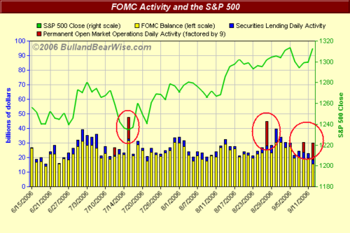
Those red spike thingys represent, as best as I can understand it,?FOMC liquidity injections. ?I believe this is typically acheived by the purchase of U.S. Treasury and federal agency securities, thus injecting cash into the system.? I’ll just let you draw your own theories from this but I don’t think you can keep yourself from being at least somewhat intrigued.
This chart comes from BullandBearWise via another blog (since it is actually subscription-only material).? BaBW is an interesting site in its own right, tracking economic releases to form a sentiment index.? This index seems to work like you would expect: high (>70) is overly bullish or “sell” and low (<40) is overly bearish or “buy”.? Like any indicator, it’s not perfect and can leave money on the table.? No indicator should be used alone but even just a simple trendline filter added to this would work pretty well it seems.? Add it to your toolbox or discard it as you see fit.? What I like is that it takes a flaw that most investors have (reacting typically useless news releases as “good” or “bad”) and aggregates that herd behavior into a chartable index.? If there has been nothing but “bad” news for weeks as the media perceives it, then the market is probably at a bottom etc.? Pull up the chart?and use the comparison feature to put the S&P 500 chart next to it.? Now throw in liquidity spikes and you have hours of fun for the whole family.