Fri 29 Sep 2006
When I read this?AP report, my head spun.? Why?? That’s what happens when the media spins every number coming out of the Fed until you can’t help but get some bodypart caught in the whirlpool.? This is a perfect example of what happens when monthly changes in economic releases are compared instead of looking at year-over-year.? Ahead Of The Curve spends several chapters discussing the flaws of comparing one month to the next instead of looking at annual rates of change.
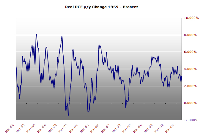
If you believe this article, we are all doomed.? But a simple glance at y/y charts shows that income has been?accelerating like a shot and that this, in turn, has now caused consumption rates to turn upwards.? So the very numbers that spell doom to this writer, are actually reflective of an improving picture.? Same numbers, completely opposing views.? Here are the y/y charts of my two favorite economic indicators, real hourly income and real PCE (i.e. consumption):
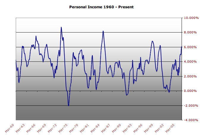
They are both pointing up.? Up is not down.? The income chart is the one that has most fueled my feelings of late that things, for the time being are going to be good before they are bad.? Just last night, I drove past a newly opened casual dining “box” and saw a full parking lot and a line around the corner.? This was just after filling up my tank on what felt like cheap gas on my way out to eat at another restaurant.? And has anyone seen the madness at The Cheesecake Factory lately?? I said to my wife that the higher incomes look like they are being spent and today’s numbers are showing the rise in consumption.? In fact, as the theory goes, higher incomes nearly always lead to upward pressure on consumption, especially in our poor savings environment.? While this is a simplification, it’s a good one most of the time.? I was never ready to sell the farm as long as the income numbers were up and now that consumption is also,?I don’t think we’ve?peaked.? Next in line should be a rise in industrial production and capital spending.? Finally, corporate earnings.
What this means is that I’m finding myself more and more in the soft landing camp even though I need to do more to round out?the picture, as housing and commodities will more than likely play a big role..? While I’m very data dependent, I’m not willing to call recession until I see real income rates drop y/y.? I should note that they are nearing historically high rates so this could mean that the rosy picture is not going to be around long.? But the important point is that there is usually a lag in these systems.? Even once it starts down, it will take some time for consumption to turn, for production to slow etc.? This should mean that there is time left.? There, now I’ve jinxed it.
I can’t help but notice too the negatively that seems so common these days.? It’s cool to think hard-landing right now and that sends up red flags.? This article is what the average investor is reading.? The prediction markets are all betting hard.? The blogs are getting bearish too.? Everyone is talking about the yield curve.? But I just can’t see it happening tomorrow.? But data can change and 2007 can bring anything.? Rather than make an all out prediction for the Dow level on Tuesday the 15th of May, I’m just going to keep and eye on these charts and try not to do anything that doesn’t make sense in context.? No matter what “yahoo” people say.
If you like the depressing, there are certainly plenty of arguments for it.? Here is a nice summary from the King of Permabears (and thus represents the extreme view).? I feel like the guy with the devil and angel on?his shoulders.
PS
There was some mention of the worsening inflation picture too.? But look at the PCE deflator, a measure of inflation derived from the PCE:
Now think what you want about the flaws in measuring inflation, but my point is?that the number is going down and the AP says?up because of the arbitrary way they choose to describe it.? Watch where you step.? There is crap?everywhere.?