Wed 26 Sep 2007
Here is a chart from the NY Times covering the resale price of existing homes.
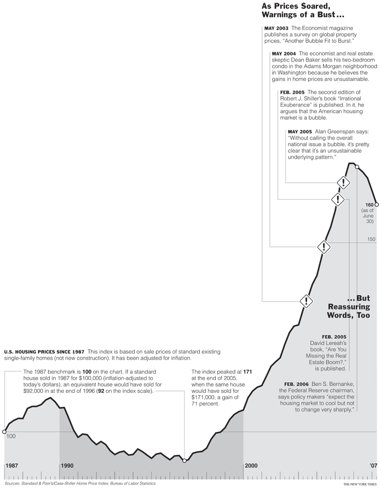
The chart is adjusted for inflation. While the purpose of the chart is to say that some people saw the bubble coming… that’s not why it is interesting to me.? There are two other points worth noting.
1. Prices declined from 1989 to 1996 — a whopping 7 years.
2.While prices have fallen, they have not fallen by that much.
So far since the peak in this index, prices have fallen around 6%. Back in the early 90s, prices fell approximately 15% (a guess, I don’t have the energy to dig up the original data series).
I’d probably want to look at a longer data series to draw any additional conclusions from this chart. But, as we’ve discussed before, there are a lot more ARMs that need to reset before the selling pressure subsides…