Wed 4 Mar 2009
I was just looking over some charts, and figured I would upload a few here to share my thoughts.
As far as the SPX is concerned, I think it has decisively breached support. Whether it turns out to be a false breakout or not depends more on time than on distance (in my opinion). With the time frames being so long (97 to 02 to 09), I wouldn’t call it one way or the other for another 6 months or so…
Here is the most recent 3 years of the S&P 500 (SPX) Index:
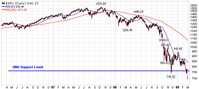
That line on the chart marked 2002 support level is approximately the lows back in 2002. Many would argue (and justifiably so)that support lines are a range of support, so take the hard, thin line with a grain of salt.
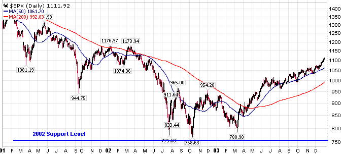
And here is the same line going back to 1997 timeframe…
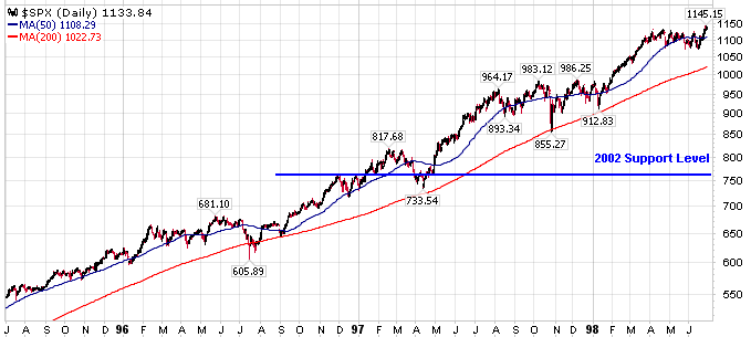
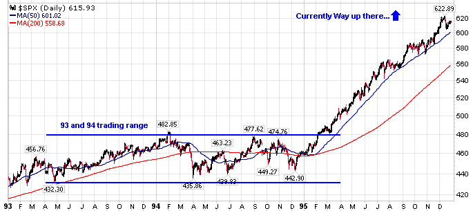
If the current breakdown isn’t a false breakout, then the 1996 trading range would come into play as the next support zone.
I’m not basing any of my trading off of these support zones, though many other people do, thus creating a self-fulfilling prophecy. To me, the real value is knowing where other people are focusing, and adapting to the situation as it unfolds.
As they say, technical analysis is in the eye of the beholder.
Coincidentally, you can see the same relative approximate support zones in the Dow (current, 2002, 1996, 1996 closeup).
Amazingly enough, the Nasdaq (NDX or COMPQ) hasn’t broken below the November 2008 lows yet. One potential cause for this — it had already fallen 54% from its 2007 peak (NDX specifically), while the SPX is now at the same 55% decline. Basically both the NDX and SPX are at the same position relative to their highs, the NDX just dropped further (was an outperformer to the downside) during last year’s market lows.
Another cause is the fact that the NDX specifically excludes financial companies, and this sector is obviously not contributing well to overall market strength.