Wed 4 Mar 2009
A neat little feature at StockCharts is the Vol By Price annotation on the charts. Here are the charts from yesterday with this feature turned on.
Note, I used the Dow index instead of the SPX due to a lack of volume data for SPX in the 90s on their website.
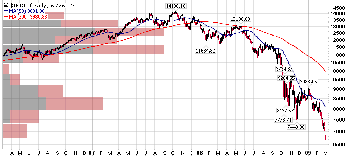
I’m not quite sure how they calculate the bars on the chart, but you can at least see the relative volume traded within different price ranges. I also assume the black and red division is how the up/down volume is divided in that price range (black = volume from up days).
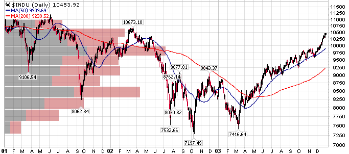
You’ll notice the rather large volume in the 95-98 range in both the 5500 and 7800 ranges. Does this mean those are stronger areas of support? You tell me.
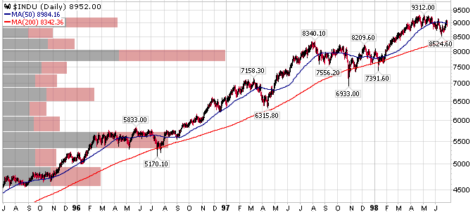
I’ve included the links to the StockCharts pages so you can go play around with timeframes and the other indicators, if you’re interested in that sort of thing.
March 5th, 2009 at 2:36 pm
Looks like a rough attempt at Market Profile.