Tue 18 Oct 2011
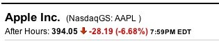
While AAPL’s recent quarter was quite impressive, they did not meet the expectations of the wall street analysts when they reported quarterly earnings. After hours trading had the shares trading down by over 6.5%.
I am a believer in Apple’s products (and I also own a few shares), but le Stock Market doesn’t like it when a string of “beat every estimate” quarters is suddenly interrupted by something they quantify as a “miss”.
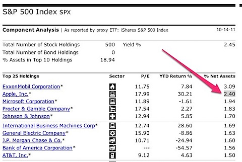
It’s also worth noting that AAPL is not just the hot name du jour. It is the 2nd highest weighted component of the S&P 500 Index at 2.4% of the index’s market-cap based weighting.
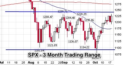
If traders needed any reason to sell off from the top of the current trading range, this certainly qualifies…
The largest risk to AAPL in my opinion is the greater economy and broad stock market risk preference. If we are entering another recession, then fewer people will have the appetite for an upgraded iPhone, or high monthly phone bills for a smart phone data plan.
On the flip side, AAPL is hardly in trouble. They have over $80 billion in cash now, and are expecting to sell more iPhones and iPads next quarter than I thought were possible. Despite the large daily percentage, it’s worth noting that this is probably an overblown after-hours reaction, and a 7% decline only wipes out the price gains from the last 6 or 7 trading days.