Mon 30 May 2011
A couple of weeks ago, John Hussman wrote an article called “The Menu” that has some very interesting analysis.
In the article, he highlights this chart as The Menu of anticipated returns based on his models for different asset classes.
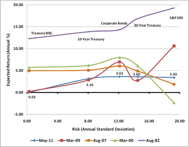
Quoting Hussman,
Note that all of the figures in the chart below are prospective returns based on data that was available at the time (though it should be clear from the chart above that actual subsequent market returns have closely tracked the projections from our standard methodology, which is described in detail in numerous previous market comments). Again, for securities with maturities up to 10-years, prevailing yields-to-maturity are sufficient. For the S&P 500 and 30-year Treasury, the chart uses prospective returns based on existing valuations. So the figures for the S&P 500 below, for example, map to the expected returns from the model presented above.
Note that the blue line near the bottom of the expected returns is the current market environment.