Macro


This should put things in perspective…

To try to exorcise the Great De- pression, President Herbert Hoover deployed fiscal and monetary stimulus equivalent to 8.3% of gross domestic product (i.e., GDP for 1933, the year the Depression officially ended). To banish the demons of 2008-9, successive administrations have spent, or encouraged to be printed, the equiva- lent to 28.9% of GDP. A macroeconomist from Mars, judging by these data alone, would never guess how much more severe was that depression than this recession. The decline in real GDP from August 1929 to March 1933 amounted to 27%; that from December 2007 to date, just 1.8% (?just 1.8%? is the phrase to use if one is still employed). So for a slump 1/15th as severe as the Depression, our 21st century economy doctors have admin- istered a course of treatment more than three times as costly.

From Grant’s Interest Rate Observer.

I was just reviewing an old post on liquidity analysis, and I thought it would be worth re-visiting the topic with some updated graphs.

First, the context… from that post back in October 2006:

…there is a 4 step hierarchy in terms of what drives markets. The first step is liquidity, then flow of funds, sentiment, and microstructure indicators (i.e., microeconomics or technical analysis). The basic idea is that everything flows from liquidity, and that liquidity is the largest of all influencers. The liquidity environment (expansion or contraction) is the mother-trend and is the ?rising tide that raises all ships? when expanding.

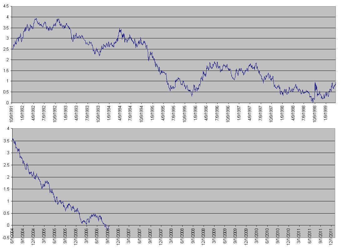
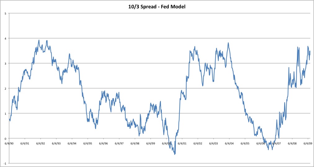
…A falling value on the chart of the yield-spread indicates liquidity expansion as the yield on the 10 year gets closer and closer to the 3 month. Inversion occurs when the value on the StockCharts graph is below 1.0. A rising value indicates liquidity contraction.

Here were the two charts presented in that post:

2000 vs. Now 1994 vs. Now

Now, on to the current situation. Suffice it to say, we’ve experienced quite a liquidity contraction, with interest rates dropping like crazy.

Let’s first look at the last 20 or so years… (click for detail)

200908021838.jpg

One quick note — the post in 2006 was written with yield spread inversion in mind. As we can plainly see, that inversion did not last long (6 months?), and the resulting rise in the yield spread obviously corresponds to the vanishing liquidity that we have endured since then.

It’s very interesting to note that the current spread between the 10 year and 3 month yields is back up to the same approximate levels as in 1991 as well as in 2001-2004, certainly both times of economic stress. Is this a natural stopping point for the yield spread? I’m not sure, but it will be interesting to watch. An argument could certainly be made that we have gone as far as we are likely to go in liquidity contraction, if things hold to the norms of the past two decades. (Note that any good statistician will tell you a sample size of 2 means nothing…)

Just as when the yield curve was inverted, it is important to wait for evidence of a trend change before passing any final judgement.

Nice animated, graphical work over at Tip Strategies to cover unemployment across the US over the last few years…

Picture 1.png

It’s worth revisiting the inflation vs. deflation argument as things have been changing quite a bit over the last few months. Below is the chart of TIP:TLT that is my measure of inflation expectations. Going into the end of 2008, we saw a rather significant deflation scare. Anecdotal evidence abounds for prices and wages falling, and indeed it may be more than just a scare.

Picture 1.png

You might notice that the ratio has rebounded strongly in 2009, indicating that the investing masses may have a relative preference for TIPs over normal bonds. Despite the message the market is sending (as observed by the ratio), I haven’t heard much rumbling about inflation, except from the contrarian camp.

The real question is whether we’re returning to a “normal” expectation of inflation, or if people are just not as convinced about deflation as they were during the crash of 08.

Obviously time will tell, but if the ratio were to reverse strongly, that would be a good indication of another deflation scare. Likewise, it will be interesting to see where the new trading range is as the market figures out the “new normal”.

Hear that giant crashing sound? That was the sound of the US Dollar dropping 2.5% today when the Fed announced it will be buying treasuries.

Picture 1.png

Here’s the 30 minute chart. I’ll let you guess when the FOMC meeting was:

Picture 2.png  

That’s a big single-day move, sure to be felt like an earthquake all around the world… let the race of currency devaluation begin continue!

If you’re not familiar with the phrase “this time it’s different”, …

The thing worth noting is that everyone who might say “this time it’s different” in bullish times is lambasted. But in bearish times, everyone is basically saying this… to pick on one person, John Mauldin recently wrote “We are in an economic period unlike any other we have faced.” I don’t want to make light of the difficulties we face in the economy right now, but isn’t this a couched way of saying this time it’s different?

It reminds me of an old saying in sociology/psychology… Functional families are all the same, but dysfunctional families are all messed up in their own unique ways.

Can we say the same for the markets? Bull markets are all the same, but bear markets are all messed up in their own unique ways?

This is a bit of a drive-by post and I’m not going to comment for now on the chart below. I haven’t really absorbed it mentally yet. I don’t know the source of this data either so take it with a grain. But discuss…what does it mean? My god, what does it mean?

debt-contributionserendipitythumb2

The WaPo posted the following graphic that details Congress’s $819 billion stimulus package.

stimulus-sm.jpg

Wonder if all this stuff is a good idea or not? Read the Mish’s opinionated piece on the topic.

There’s an old saying, “In the land of the blind, the one-eyed man is king.”

In global economies, the US situation looks horrible, until you compare it to everyone else. Below is the chart of bank liabilities relative to GDP.

In this case, we might say that in a world full of bankrupt economies, the slightly-insolvent economy is king.

200901311349.jpg

Source.

Check out this nice MSNBC feature for jobs by sector and unemployment rates by state. On the state unemployment, be sure to note the slider at the top that allows you to shift it by each month of 2008.

What is fascinating to me is the number of sectors that are not in a downtrend for the second half of 2008… Local, State, and Federal Governments, as well as Education and Health Services (Quasi-Government), and “Other” Services. I’m not impressed by the uptrend in “Natural Resources and mining” due to its very small size by comparison to the other sectors.

Also interesting, the “Information” sector, in which I believe we would fall, has been in a decline since 2001.

Picture 1.png

« Previous PageNext Page »

Subscribe to Tasgall

Categories

Archives